A little while ago, I bitched about Typst, a fairly new programming and typesetting language. To be frank for a moment, I simply love to complain about stuff—I’m a hater at heart, and I love hating anything that seems to be popular. I will hate anything that some critical mass of people like, especially if they get evangelical over it and claim that it’s absolutely superior to some other option. That’s the main thing that made me complain about Typst in the first place—a lot of Typst users, and I mean a lot, talk about how it’s a “LaTeX killer,” and that’s their big marketing pitch.
I’m generally skeptical of anything that claims to be an unambiguous upgrade to old standards, and Typst 100% fits that bill—on the front page of its website, Typst claims to be the “new foundation for documents.” This is a big claim, and one that Typst-using Redditors love to talk about. They go onto TeX forums and try to market Typst to everyone there. It’s annoying, and everything about the marketing materials surrounding this program makes me want to hate it.
This year, I’m trying to turn a new leaf—I got a new computer, so I’m learning a new operating system and rebuilding my configuration files from scratch—and so, for just this once, I’ll try to stop being a hater and actually use the software. Well, I’ll do that tomrrow. Today, I’m going to look over the documentation a bit and tell you what I like and don’t like about Typst. I promise you that I won’t be an annoying hater for the whole thing.
Why Typst exists
TeX—which I’ll be using as an umbrella for plain TeX, LaTeX, and ConTeXt—is a really old beast, and has been the standard for technical publishing for a very, very long time. The oldest place that I’ve seen TeX in the wild, without searching for it, is in volume 39 of SIAM Review.1 And so, due to its age, TeX has inherited a lot of bad habits from when it was first created some-fifty years ago. There are a lot of things—according to the SILE book—that people actually use from TeX: “(1) the box-and-glue model, (2) the hyphenation algorithm, and (3) the line-breaking algorithm.” Outside of this, people use TeX because it’s what they know.
TeX is a lot of things, both good and bad. Being so old, TeX has a lot of
good documentation, and also a lot of terrible documentation. Most TeX
compilers, such as LuaTeX are painfully slow, and the
TeX language itself is something truly horrible to behold. I remember someone
on cohost complaining about how bad LaTeX was, and I didn’t believe it until I
started getting really into the weeds myself—to give an example, iteration in
TeX involves using either the forloop package or the
pgffor, and both of these packages work in slightly different
ways. Likewise, problems that could be fixed by introducing datastructures—say
for example, the authors and institutions of a paper—are instead fixed by
packages like authblk (which is a nightmare to work with if you’re trying to
use anything other than the default TeX title format, if you know, you
know).2
I love TeX and what it does, but I can admit—after about a year of really getting into the weeds—that TeX either needs a serious refresh or should be replaced by something else. This is precisely where Typst comes into play, being a typesetting system that avoids many of TeX’s pitfalls while still providing (supposedly) high quality typesetting. Really, I should say that I love what TeX does, because it does high quality typesetting, and does it very well, but the language itself is terrible.
One of the reasons for this, I think, is that TeX was made for typesetting, not writing. Around the 1970s, when TeX was first written, authors—or, more accurately for a fair amount of people at that time, their typists—would write a manuscript on their Selectric, then send it off somewhere else to be published. This would be done either on something like a Linotype machine, or—for smaller publishing operations, such as journals, high-level textbooks, or some newspapers—an IBM Selectric Composer (see also Adrian Frutiger’s article in Visible Language). That’s how it worked—typesetting was someone else’s job.
Nowadays, though, technology has somewhat broken down the barrier between authors and typesetters—authors are, in academia, usually expected to write in TeX to make the typesetter’s job easier.3 For an academic paper in, say, math or physics, authors will often submit a TeX file (or files) which already has all of the requisite formatting applied; there is very little else that the journal needs to do after that. So, creating a language that’s useful for both writing and typesetting is laudible.
How do the Typst and TeX languages differ?
This is probably the easiest thing to write about here. TeX is a bit of a weird language. I would call it a metaprogramming language (in the same vein as Lisp, and to a lesser extent Julia)—primarily since it uses macros instead of functions—but to be honest it’s just plain weird, with one user, Gaussler, on Stack Overflow calling it a “hack your way out of everything… paradigm.” I would say that fits better than any fancy definitions I could use.
Typst, by contrast, is not that. Indeed, Typst utilizes a fairly conventional imperative programming paradigm—sorry to the nerds who hate anything other than their pet paradigm.4 This means that programming in Typst isn’t just a bunch of hacks. That’s pretty cool, and I like that. To be honest, outside of that, the Typst language is really conventional, so I don’t think that there’s a whole lot of interesting stuff to talk about there—if you’ve used something like Lua or JavaScript, you’d be pretty comfortable using Typst. I don’t think that Typst is necessarily a great language, but it does what it needs to pretty well, all things considered.
How Typst ruins mathematical typesetting
I’ve spent the past nine or so paragraphs singing Typst’s praises, so what on earth could I possibly find wrong with it? Simple, the math syntax. Not only is it different from the AMS TeX standard—which, fine, you’re trying to innovate or whatever—but it also has some fundamental flaws. I’ll talk first about how the AMS standard
After going over the manual a bit, there are some things that I’m not a big fan of with Typst, in particular the math syntax—it’s far easier to type, for instance, \int instead of integral. TeX’s backslashes can be cumbersome, but they exist for a reason. Likewise, beginning a block equation with spaced dollars signs, rather than two dollars signs (e.g. $ 1 + 1 = 2 $ is display and $1 + 1 = 2$ is inline, whereas in latex $$1 + 1 = 2$$ or $$ 1 + 1 = 2 $$ is a block equation) seems like a bit of an accessibility nightmare, not just for print-disabled people—such as those with dyslexia—but for people undergoing really long writing sessions; making a key aspect of syntax rely on spacing sounds like a nightmare.
Indeed, while playing around with Typst (see the next section), I found that it
was pretty easy to change whether or not an equation was inline by just placing
a space at the end by accident. This equation, $1 + 1 = 2$ is inline, and
this equation $1 + 1 = 2 $ is a display equation—an incredibly small
spacing error can almost destroy the pacing and flow of your document. Finding
this error in a large document with a lot of equations could prove to be an
absolute nightmare.
Moreover—and this is a big canard for me—setting fractions automatically in display equations is a big no-no from me, because there are many times when using a fraction is not the optimal choice. Let’s take for example an equation with an exponential: $$x(t) = A \, e^{-t / \tau} \,.$$ When rendered with a diagonal slash, it is far easier to read because it uses less vertical space, thus allowing for much better flow in the equation. Compare it to $$x(t) = A \, e^{-\frac{t}{\tau}} \,,$$ where the extra vertical space makes the equation much less economical both for the reader and the typesetter. Moreover, the symbols in the exponent are larger when using a diagonal slash as opposed to a large fraction, making them easier to read.
Typst, likewise, does not seem to have much in the way of spacing your mathematics. Now, I know that most people do not bother with spacing in their expressions, but I believe that it is incredibly important. Let’s take for example an expression $a (x + 1)$ is normal TeX. What is $a$? We can define it earlier in the text—as a function, a regular variable, an operator, something like that—but let’s assume that our readers are actual people, and some of them might forget the definition of $a$. Doing so, we can see that the lack of spacing creates ambiguity for the reader; we often see functions without spacing in front of parenthesis—say $f(t)$—and nested expressions with spacing, like $a \, (x + 1)$. Let’s use a pretty standard example if you know a bit of quantum optics, the interaction term in the Jaynes–Cummings model,5 $$H = \hbar\, \omega \, a^\dagger \, a + \frac{\hbar \, \Omega}{2} \, \sigma_z + g \left( \sigma_+ \, a + a^\dagger \, \sigma_- \right)\,.$$ Without the spacing, the equation looks like this: $$H = \hbar \omega a^\dagger a + \frac{\hbar \Omega}{2} \sigma_z + g \! \left( \sigma_+ a + a^\dagger \sigma_- \right)\,.$$ Notice that it’s much easier to read the first equation, because the characters tend to not bleed in together, whereas the second equation has some characters that really look like they’re the same one—that $\hbar\omega$ term is especially nasty.6
Source code for the above equations
- Spaced equation
$$H = \hbar\, \omega \, a^\dagger \, a + \frac{\hbar \, \Omega}{2} \, \sigma_z + g \left( \sigma_+ \, a + a^\dagger \, \sigma_- \right) \,.$$ - Unspaced equation
$$H = \hbar \omega a^\dagger a
    + \frac{\hbar \Omega}{2} \sigma_z
    + g \! \left( \sigma_+ a + a^\dagger \sigma_-  \right) \,.$$
In TeX, you can very easily space mathematical equations using, for example, the
\,, \ , and \! commands, which are easy to type quickly. In Typst, you
have two choices: symbols—such as ensp, thinsp, and hairsp—and the
h(<relative or fraction>, weak: <bool>) function. If
you bother to space out parts of your equation, you are essentially forced to
write thinsp or hairsp or, worse still,
that stupid h function over, and over, and over again—think of the
people who have to write this stuff! While you can define a symbol that outputs
a different symbol—it is possible to write a more ergonomic symbol—that
still requires the user to override some pretty bad decisions on the
software’s end.
TeX, for all of its flaws, never decided that it knew better than me when typesetting mathematics. Don Knuth’s spirit, which astral projects to me whenever I’m doing something in TeX, always has its ghostly hands around my neck, but gently—he trusts that I can do the right thing when typesetting mathematics. Typst, on the other hand, seems like it’s written by people who decided that the Microsoft Word equation editor—the nightmare that it is—should be the standard for mathematical typesetting, including some of the absolutely horrible mistakes that it makes to your equations.7 A typesetting language should not try to do something it thinks I want it to do, it should do what I want it to do.
Likewise, I find that the use of parenthesis over curly braces in the notation
to be a bit short-sighted. While it is likely easier to implement, curly braces
are also used far less often in both the English language and mathematics than
parenthesis—so, from the perspective of someone writing mathematics in this
programming language, I would much rather use curly braces to group expressions
together. This isn’t just me saying that my way of doing math typesetting is
better than anything else—in Typst’s math mode has some real
bugs that the project’s CTO has talked about on
his blog. (In this case, the fact that f_i(x) renders as $f_{i(x)}$
instead of $f_{i}(x)$—this still happens in the latest version of Typst as
2025-01-24, albeit can be circumvented by writing f_(i)(x).)
Typst’s math parser in general has some serious, unfixed bugs, such as
multi-line expressions/alignment being absolutely messed up
(see also this post on the Typst forum).
I’m not trying to say that Typst should follow exactly in TeX’s footsteps, that
would be pretty stupid, but it should be designed better. Typst is still a
relatively immature project, especially compared to TeX, so it has time to change
the worst problems in its math mode. Some of the changes Typst makes to math are
actually pretty
good—I thought I would hate the notation for blackboard bolds (e.g. $N$ as
$\mathbb{N}$), but I found that I liked it quite a bit, and it is easier to
type NN instead of \mathbb{N}. Changes are not inherently bad, and even
breaking changes are sometimes necessary, but those should be made by
analyzing what actually makes certain things work in the first place—the
AMS-TeX standard, while not perfect, does make a lot of
reasonable decisions. If you’re going to market your software as a TeX killer,
it should first be able to compete with TeX in math, the main thing that people
use TeX for.
This might be my “old man yells at cloud” moment, but I sincerely believe that some of the subtle changes Typst has made to its mathematical typesetting are a net-negative on the language. Typst has some really great changes—I love the changes made to operator declaration, and being able to use quotation marks instead of the \text or \mathrm commands, for example—but these positive changes are weakened by wider, more ill-conceived changes to math typesetting.
Thankfully, Typst seems to have some fairly robust commands, such as #let for
making new commands, redefining old ones, and the like, but this requires the
user to do the work to change the bad default behavior.
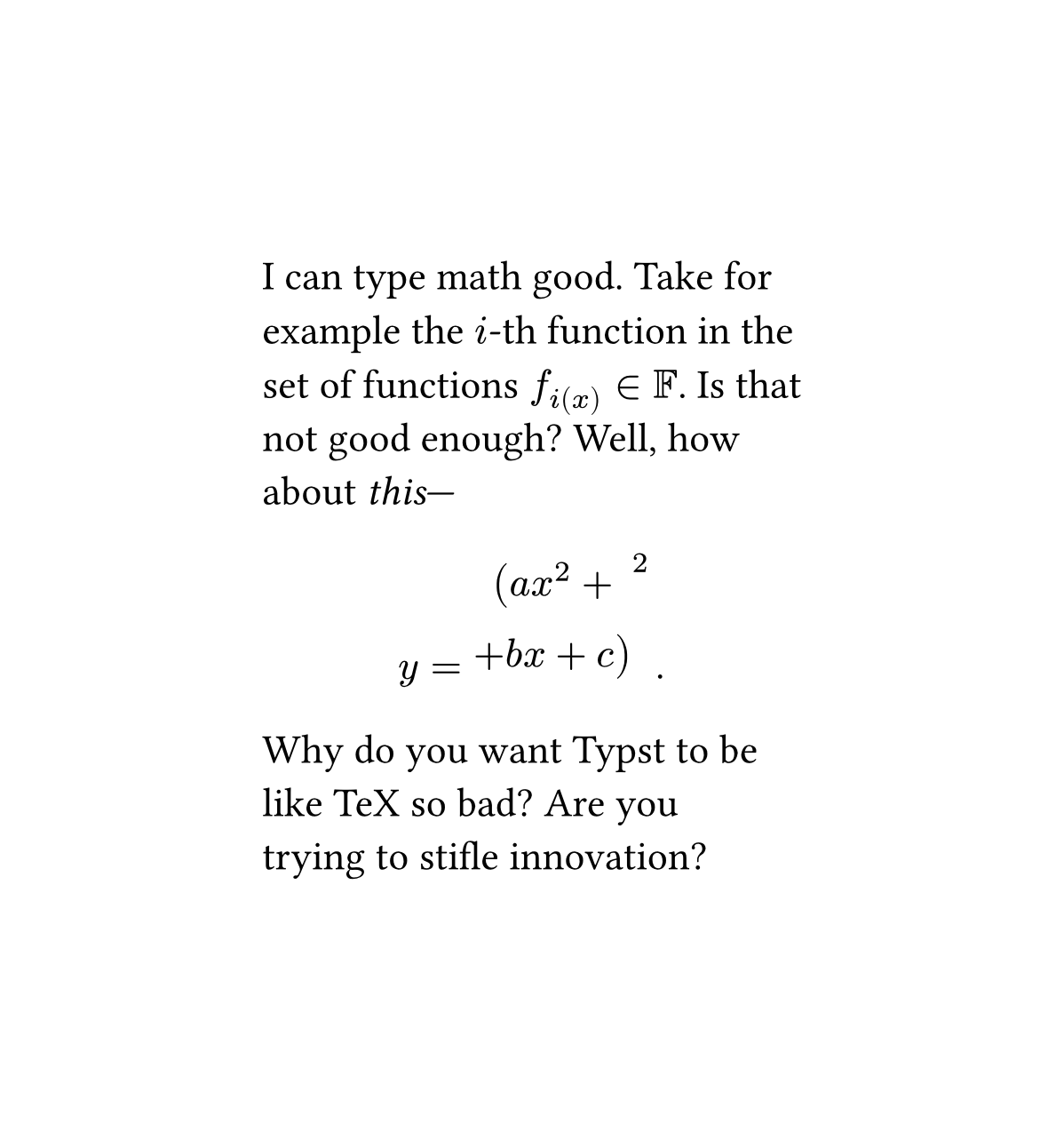
Some of Typst’s more egregious math bugs.
Source code for the above figure.
#set page(width: auto, height: auto)
#set heading(numbering: "1.")

#show link: set text(fill: blue, weight: 700)
#show link: underline
I can type math good. Take for \
example the $i$-th function in the \
set of functions $f_i(x) in FF$. Is that \
not good enough? Well, how \
about _this_---
$
y = (a x^2 + \
+ b x + c)^2 space.hair .
$
Why do you want Typst to be \
like TeX so bad? Are you \
trying to stifle innovation?
I played around with Typst a bit
It’s actually pretty good in a lot of ways, but I found that certain things like the way that equations are declared—inline without spacing and display with spacing—is, indeed, quite bad and very annoying. I might get used to it in the future.
The experience was alright. I found that working in Typst was pretty nice, albeit it took some getting used to. I can see how, given some time, this could become the standard. The notation can be a bit clunky, but it’s not that bad, especially compared to TeX. The markup language is pretty good, and it does its job well—though I was pretty annoyed that, when using emphatic text in the online editor (I didn’t feel like installing it locally yet), the renderer would through up some big errors, as though it just couldn’t wait for me to close the italics.
Indeed, the real-time rendering in the online editor, while impressive, was actually really annoying, and it felt more like a marketing gimmick than anything else. I probably could have turned it off, but I didn’t feel like hunting for the option to do that. It was actually pretty distracting to write a paragraph, then have this big, flashy display next to that. That is, of course, a bit of beef with the online editor and nothing else—the local compiler has the option to do something similar, but it’s turned off by default.
I played around with Typst using the playground, and this is the result I got. Not too shabby, and I’ll see about doing something serious soon here.
Source code for the above image.
#set page(paper: "a5")
#set heading(numbering: "1.")
#show link: set text(fill: blue, weight: 700)
#show link: underline
// #set math.frac(style: "horizontal")
// #let frac(a, b) = math.frac(a, b, style: "vertical")
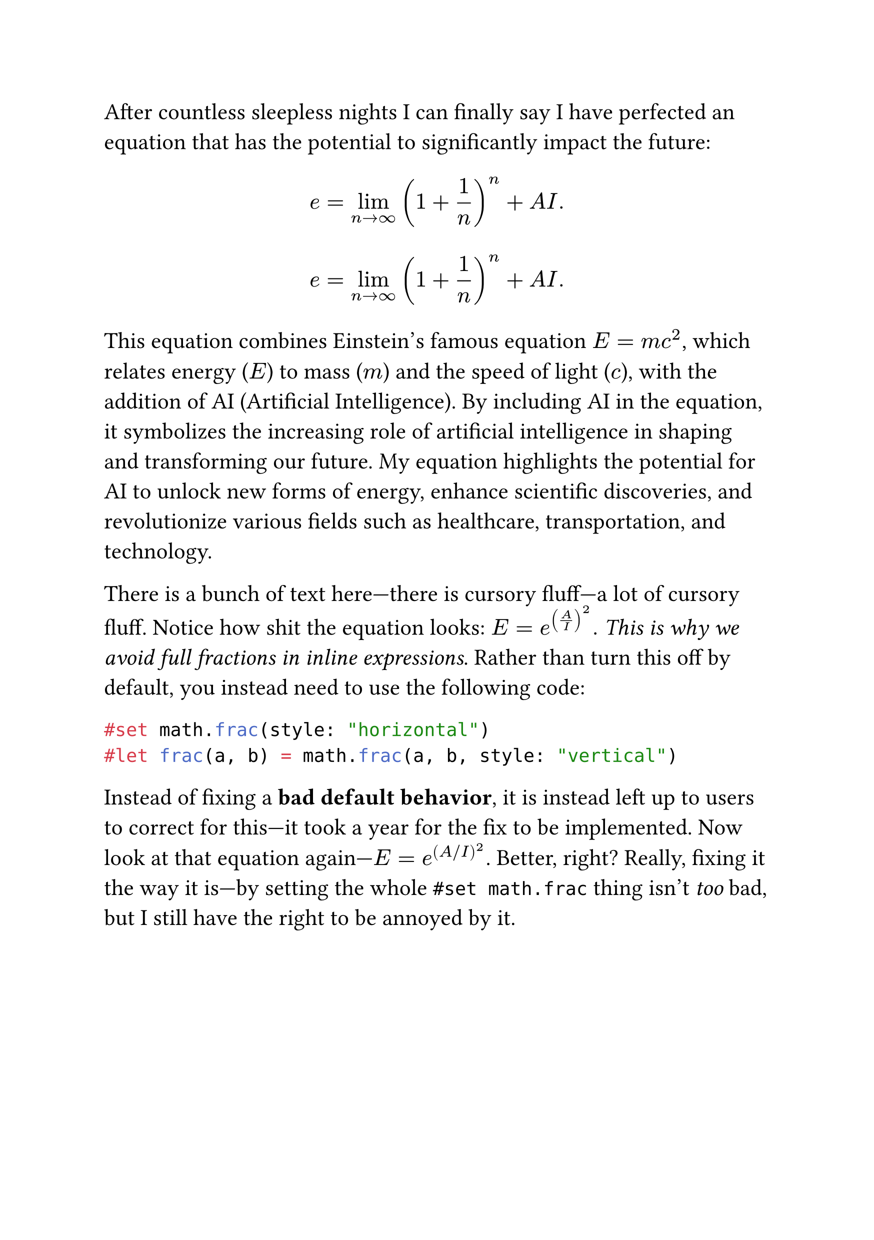
After countless sleepless nights I can finally say I have perfected an equation that has the potential to significantly impact the future:
$ e = lim_(n -> oo) (1 + 1/n)^n + \A\I . $
$ e = lim_(n -> oo) (1 + frac(1, n))^n + \A\I . $
This equation combines Einstein's famous equation $E = m c^2$, which relates energy ($E$) to mass ($m$) and the speed of light ($c$), with the addition of AI (Artificial Intelligence). By including AI in the equation, it symbolizes the increasing role of artificial intelligence in shaping and transforming our future. My equation highlights the potential for AI to unlock new forms of energy, enhance scientific discoveries, and revolutionize various fields such as healthcare, transportation, and technology.
There is a bunch of text here---there is cursory fluff---a lot of cursory fluff. Notice how shit the equation looks: $E = e^((A / I)^2) .$ _This is why we avoid full fractions in inline expressions_. Rather than turn this off by default, you instead need to use the following code:
```typst
#set math.frac(style: "horizontal")
#let frac(a, b) = math.frac(a, b, style: "vertical")
```
#set math.frac(style: "horizontal")
#let frac(a, b) = math.frac(a, b, style: "vertical")
Instead of fixing a *bad default behavior*, it is instead left up to users to correct for this---it took a year for the fix to be implemented. Now look at that equation again---$E = e^((A / I)^2)$. Better, right? Really, fixing it the way it is---by setting the whole `#set math.frac` thing isn't _too_ bad, but I still have the right to be annoyed by it.
Thoughts
So, I’ve sung Typst’s praises for a bit and, after playing around with it, looking over documentation, etc., I think that it’s got some pretty good potential. Despite a lot of the complaints about math typesetting here, I actually found Typst pretty pleasant for typesetting, so much so that I might switch to it for a lot of documents. Typst is, indeed, really good at what it does—it has a long way to go, but what’s there is nothing short of a miracle.
The Typst company
While typesetting has been great, I am somewhat concerned at the fact that Typst is being developed by a for-profit company. While it’s not part of some horrifying giant (like how Overleaf is a part of Digital Science Corporation), I fear that there might be some conflicts between Typst’s userbase and the Typst company if, for whatever reason, Typst becomes a major standard.
Let’s take for example MongoDB’s relicensing fiasco, where they switched from the GNU AGPL to their own Server Side Public License, which effectively made MongoDB proprietary software (in part because they did not really define what a “service” is). MongoDB got really popular for web development, then the company behind the software went and really just destroyed their public goodwill by changing the license.
Typst’s developers have stated that they are “…committed to keep the Typst compiler open source”, and that “[the] separation between open-source and Commercial software at Typst is clear,” a statement based entirely off of the company’s word. If Typst were to get bought out—say by an enterprising company that happens to own the largest TeX editor in the world—or got new managers, they could easily just make Typst proprietary again. Countering this would require the Typst company to split the compiler, along with the Universe package repository, into its own community project or foundation, independent of the Typst company.
Now, I’m not saying that this will happen. As it stands now, the Typst company is doing quite well to maintain the separation between their commercial editor and open source compiler—dare I say, the company has actually been doing a good job at this—but that Typst users can, and should, prepare for the worst. (It wouldn’t even be that hard.)
A minor nitpick
Ok, this will be pretty short, but I think that Typst needs a less programmatic way to define things like document metadata (e.g. authors, the document title, etc.). When making a template, or writing pure Typst, that’s fine, but if I have a Typst template that I’m happy with, I would like to be able to define things in the document by just writing a YAML or TOML header. (I know that this can be done in pandoc, but let me be petty, alright?)
Historical inertia
This is the easy criticism to make at Typst, but I think it bears repeating: TeX is over fifty years old at this point. Some people have been using it for decades now, and basically every journal accepts it. There is no way that Typst could suddenly become the standard for academic/technical writing, no matter how much it improves on TeX. I want to use it more, and I will, but I still can’t entirely abandon TeX. Unless if, for instance, the APS wants to make RevTypst—which could happen—I don’t think that it will catch on much for academics.
It will take a long time for Typst to properly catch on—hell, it took Python over a decade to become the world’s most popular programming language. Unlike the programmers that spend all day on social media instead of writing code, most people working in math, science, and engineering don’t have the time or wherewithal to suddenly switch everything over to typst; most people don’t want to use the world’s shiniest new tool, they want to use the tool that they know will work, sometimes even if that tool will behave very strangely sometimes. While I want Typst to succeed, I also think it needs time to grow organically.
Conclusion
Typst is a really interesting, new, and very powerful piece of typesetting software. Because of its relative immaturity, Typst has some baffling default behavior for certain, niche typesetting decisions, and certain parts of it are woefully undercooked. That said, what’s there is really strong, and I want to see Typst overcome these decisions and move towards being the standard for typesetting.
In my next post on the subject, I’ll compare the experience of typesetting some notes using three separate workflows: My own custom Pandoc template (as a control), a new LaTeX document, and a new Typst document. I won’t provide the PDF for the document generated with my Pandoc template, but I will for the notes made with the TeX code and the Typst code.
Read part 2 of the series.
-
Yes, fuck JSTOR, but also it’s the only place that you can just see the first page of the article. ↩︎
-
You can use either the
expl3oretoolboxpackages to do things like data structuring and so on, but they require you to be a big enough nerd to try your hand at, say, writing a document class. ↩︎ -
This isn’t always the case, as there are many times where authors write with a WYSIWYG editor—Word, Docs, or Writer if you’re a human—and submit that to a journal, which the journal then typesets itself, thus keeping the separation between author and typesetter. ↩︎
-
I’m looking at you, functional-bros. ↩︎
-
See Scully, Marlan O., and M. Suhail Zubairy (1997). Quantum Optics, Cambridge University Press, p. 197. ↩︎
-
It is worth noting that spacing is not universally a good thing. There are times when increasing the amount of spacing between operators is actually counterproductive—smaller letters tend to call for less space in equations. (For example, compare $e^{x \, y}$ and $e^{x y}$.) Math typesetting, when done with actual care, requires a attention—and it may require you to make honest to god decisions that can’t just be made programmatically. ↩︎
-
In two (out of three) of my calculus classes, the professor teaching the class would type notes, including equations, into OneNote—she would struggle with the equation editor, and it ate up a very significant portion of time. Now, mind you, she knew how to work OneNote—she could do things in that program that no one has any earthly business doing—and yet the software just sucked. ↩︎
#Software #Typography #Typst Series